Since iOS 6, Auto Layout has been the preferred way of arranging your UI components across iPhone and iPad. With iOS 8’s new size classes, its importance only grew. Achieving your designs by thinking in constraints is tricky, so I thought I would give an example of a non-trivial design problem I solved.
At first blush, this seems simple; just add spacing constraints to each UI element relative to each other, and the UIDatePicker will expand and contract horizontally as necessary. But what about localization? If the sizes of the labels change, text will be truncated and it’ll look terrible. We also can’t know which label will be the widest.
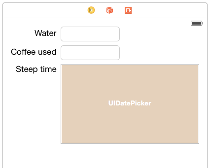
What we need to do is model these labels as a system of inequalities. Each of the labels’ left edges should be at least 0 points from the left margin. But what is to stop them all being over 0 points from the left margin? What is to stop this:
The UIDatePicker fits to its intrinsic content size, but that leaves our labels hanging out in the middle of nowhere. The solution is to add a lower-priority constraint to each label:
![]()
Clearly they can’t all be satisfied, but that’s OK; Auto Layout satisfies the highest-priority constraints before those of lower priority. The inequalities ensure we have no ambiguity.
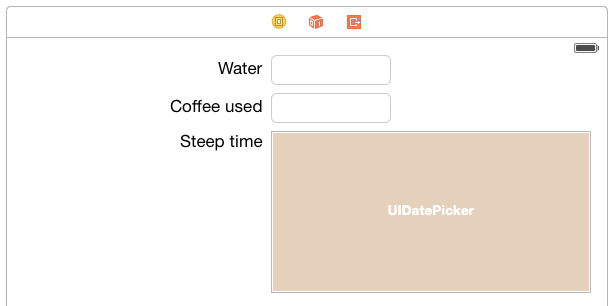
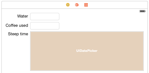
OK, that kinda worked, but why are my labels left-aligned? What actually happened here is the labels have been stretched out so their left edge is on the margin and their right edge is 8 points away from the text field (or date picker). This isn’t such a big deal for labels since we can right-align them, but for any other control that might display a frame or background, this wouldn’t work out.
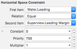
When you really need that ragged left edge, increase the Content Hugging Priority above the priority of the constraints we set earlier, for setting the leading space equal to 0. I chose 900. This means that taking the intrinsic width of the object is more important than increasing its width.
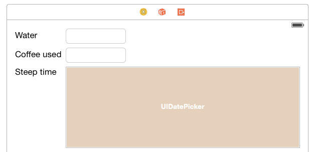
So you might think we’re done, but look what happens if I go to the iPhone 4-inch size:
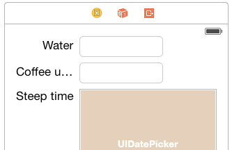
Oof, that’s bad. UIDatePicker is trying to get as much space as it can, to the detriment of our labels. We can fix this by increasing the Content Compression Resistance Priority to 900, so the labels will take the space in preference to UIDatePicker. This is the corresponding opposite of Content Hugging Priority; how important is it to maintain the original width, and when can we shrink it?
Alternatively, since UIDatePicker is trying to preserve its own desired width, we could could achieve the affect by reducing the date picker’s Content Compression Resistance – thereby making its desired width lower priority than the labels’.
UIDatePicker doesn’t really need as much space as it’s asking for, anyway – here’s a screenshot in the iOS Simulator for an iPhone 4S:
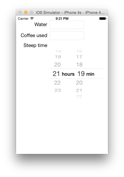
Looks like I need to work on that top margin, huh?
Hopefully I’ve demonstrated the most important tools at your disposal for creating responsive layouts in iOS: inequalities, priorities, content hugging and content compression resistance.
You can get more advanced by controlling the constraints at runtime, but the further you can go with purely design-time constraints, the easier it is to manage their complexity.
Hi! Please note an important offer for you.
http://bit.ly/2qkLvKD
Hey Look what we adopt conducive to you! an seductiveoffers
Untangle click on the relations under to cheerful
https://drive.google.com/file/d/1DfHUiWzcYjznhkZ8w_NsQWmxXaASIiE2/preview
Hi Righteous data ! an significantthe hour
To demure click on the interrelationship in this crowd
https://drive.google.com/file/d/10BahZiducJ8KcGpIXny_GzlaMIHWpnXy/preview
I believe you have mentioned some very interesting details, thanks for the post. Janifer Nowell Lund